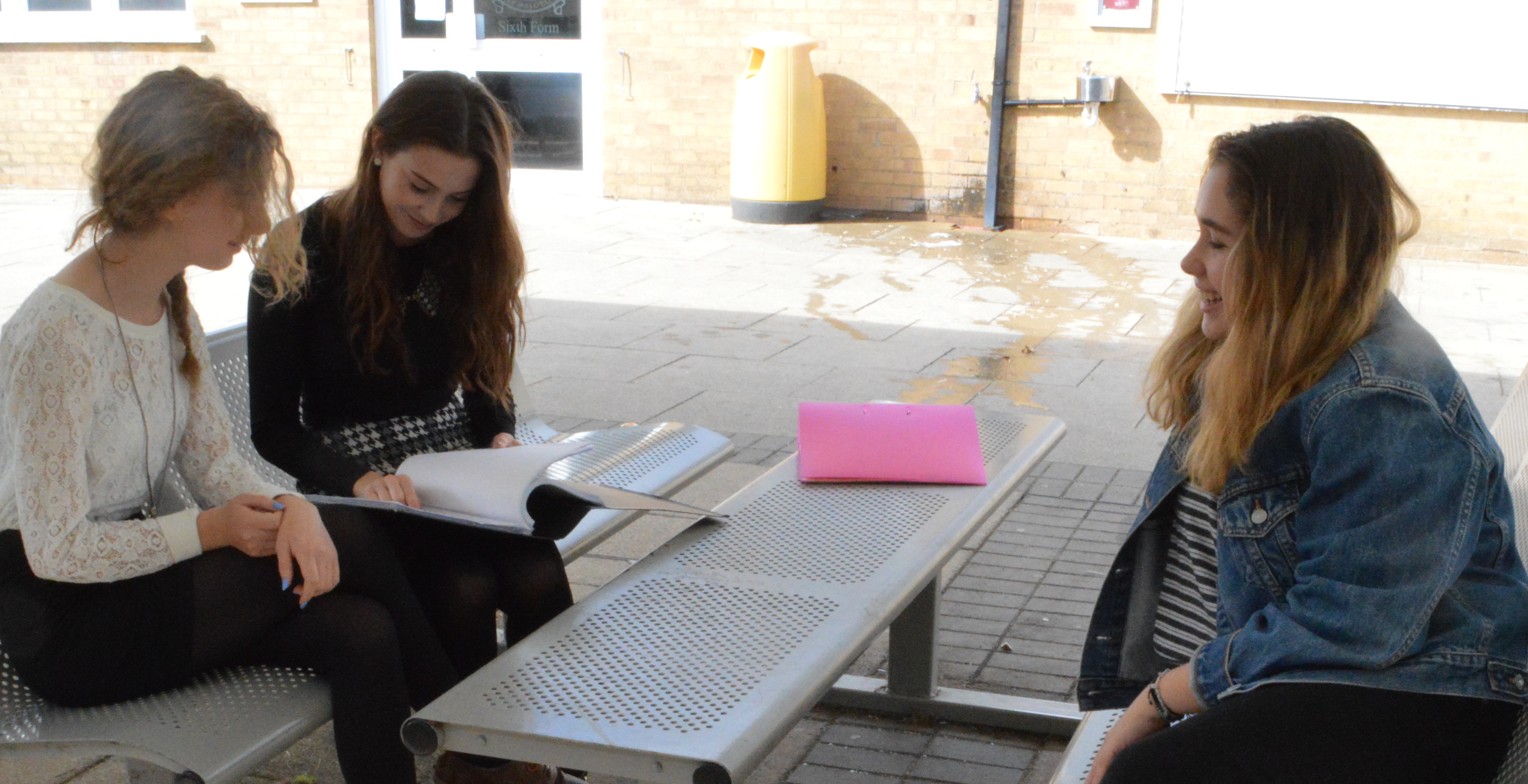
Photos I’ve taken to use for my contents page
This is a long shot. Meaning that you can see the location/setting through this image. We decided to take a shot like this as it shows a study period which is relevant to the context of the ‘student magazine’. This photo won’t be featured in my contexts page as the shot is to far away, a close up shot would be better in this case.
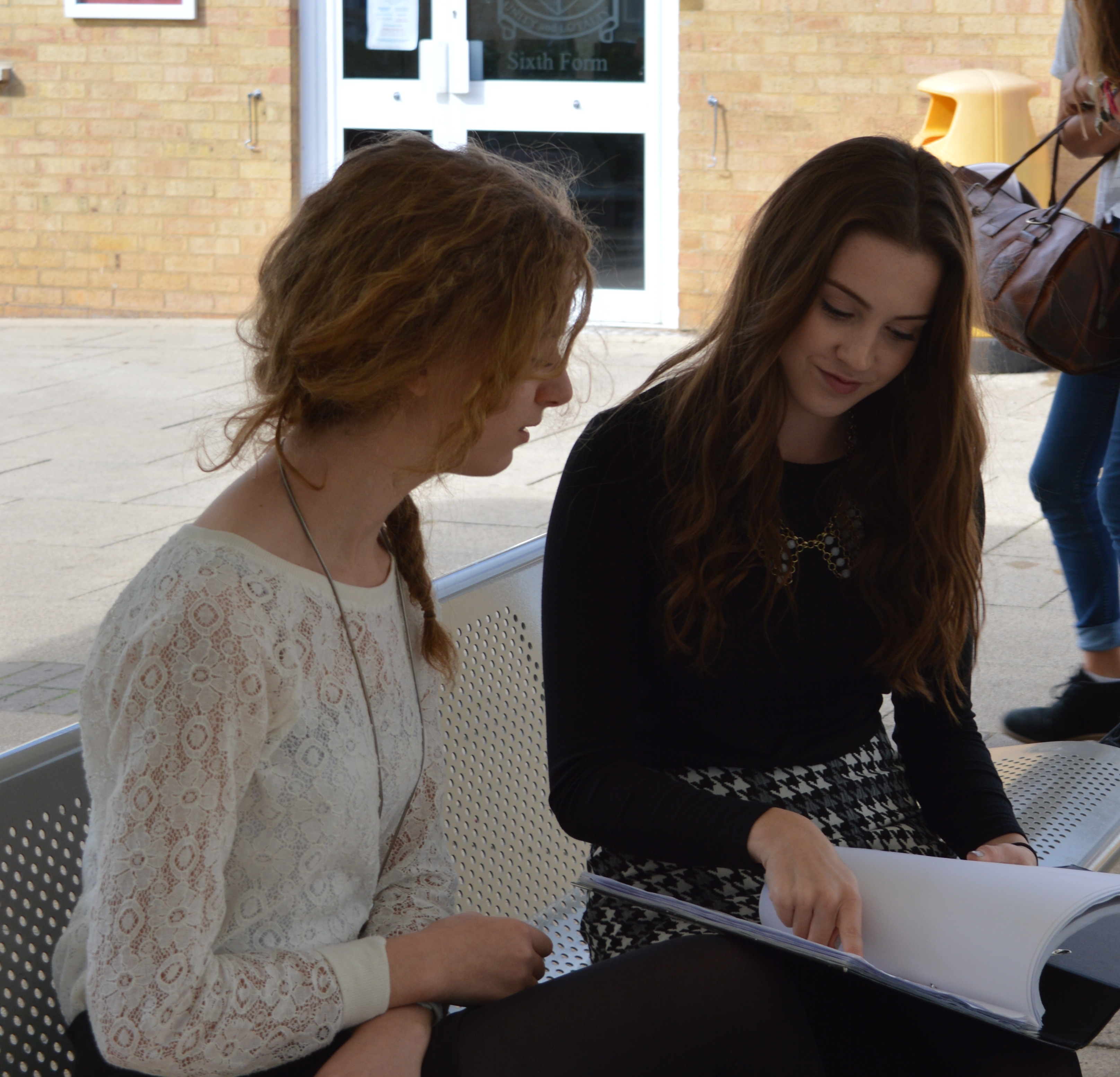
This is a close up shot, two shot is very similar to the previous photo. This shot is better as you can see the people in the shot more clearly and what there doing. I will be using this shot for my contents page but will edit out the background to make it look less busy so the shot only focusing on the two people ‘studying’.

This long shot shows students interacting with their teachers. We decided to take this shot as a long shot beacuse a long shot puts the characters (people) in a location. In this instance we wanted to show a school location. In order to take this shot we talked to the teacher to make it look like it wasn’t set up, in order to capture a realistic school photograph. I will be using this image in my contents page as it is relevant to our student magazine theme and works well as a whole image.
 over of my student magazine. I named my magazine ‘Media Monthly’ as it is a memorable name due to its use of alliteration and it fits the purpose, genre and audience of the magazine well. Also the magazine is a monthly issue which is why i used the term ‘monthly’. The font heading is in a fixed location, it’s capitalized and bold to make it stand out as much as possible because the brand name of my magazine uses a lot of characters therefore the heading had to be a bit smaller than i originally wanted it to be so that it could fit horizontally across the page. However by adding effects onto the heading such as ‘outglow shadow’ the font appears sharper and stands out better against the background. I choose the purple font as it contrasts against the background colours which enables it to stand out, because i have a brown and white background i needed a colour which could be visible over both fonts and in my opinion this particular colour worked best. I stuck to a 3 colour scheme ‘a light shade of purple, a dark shade of purple and white’ choosing the right colours is essential for making a magazine cover look like a magazine or making it look more like a poster. The majority of magazines use a 3 colour scheme as it makes it look more professional and not to over powering with colour, I have tried to interpret this into my own work to make it look more like a realistic magazine cover. Throughout the cover i have used various types of font and font sizes to interpret current magazines such as vogue and cosmopolitan. I arranged my texts in different positions to add versatility and unique. The image i used was a photo i took of my friend Gabbie. I took a close up shot slightly at an angle which bleeds of the page, this works well as a whole composition between the image and text. Even though the image is at a slight angle, Gabbies eyes are looking straight into the camera which is good because it makes the audience think that she’s looking straight at you which grabs the reader’s attention which is an important feature to use on a magazines front cover. A column inch, callout and caption is all present in my work. Lastly i added in a bar code to create a realistic look to the magazine front cover
 This is my finished ‘time’ magazine front cover. As you can see from my previous post i made some changes and added a few column inches to the cover. I made sure that the magazine’s heading ‘time’ and lucy’s eyes were above the fold to make it look like a realistic magazine cover.The heading is in a fixed location and the serif font is bold, capitalized and red matching the covers boarder which makes it look effective and more professional. The image bleeds off the page which works well within the whole composition of the magazines cover. The eye level shot of Lucy is an effective shot to use because it gives the effect that she is looking directly into the readers eyes which instantly makes the reader feel involved and that’s important for a magazine as it captures the readers attention which will make them feel intrigued and want to look inside it. I added in a caption “Towie star Lucy Mecklenbourgh” and quoted “i hired a personal trainer after my split with mario” because that actually happened. This caption will appeal to her fans as know exactly what the caption implies. I also added in a column inch ‘tumble’ and quoted “im so glad billy was my partner” because this lets the audience know that the story inside the magazine will feature Lucy’s ‘tumble’ experience and again it appeals to her fans. I also added in the ‘results with Lucy’ logo as Lucy’s recent publication in the media has been to do with her fitness regime, which lots of people have been interested in therefore by adding her logo to the bottom of the magazine cover it will appeal to various amounts of people. Lastly i stuck to a 3 colour scheme as it looks more professional and doesn’t make the whole composition to overpowering with colour. The boarder and title had to be in red as we had to imitate a copy of a ‘time’ magazine front cover. I then choose to use pastel pink and white for the column inch and captions as the pastel pink compliments Lucy’s lip colour and her nail varnish, the white font breaks the image up and doesn’t make the magazine look to pink and red. I also choose white font as it is a natural colour and contrasts against Lucy’s hair.