Institutions case study
Bauer media: is Europe’s largest privately owned publishing institutions. Bauer media UK reaches over 22 million UK consumers every week through the world-class multi-platform media and entertainment magazine brands such as Heat, Kiss, Empire, Magazine and Absolute radio. It creates and curates entertaining media specific to the audience’s tastes.
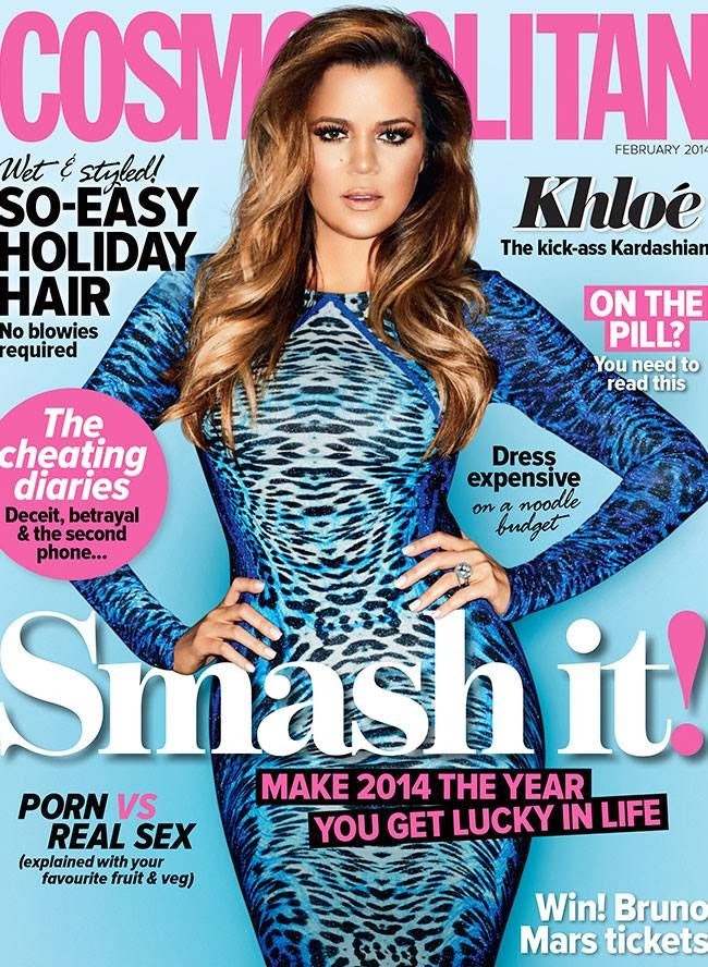
National Magazine co: has changed its name to Hearst magazines. This institution the largest digital publisher in the UK. Their reach extends to 1 in 4 UK women and 1 in 5b UK adults through their portfolio of 19 magazines and 26 websites. Hearst magazines feature, Elle, Cosmopolitan, company, best, and reveal.
Future Publishing: is a media company in 2006; it was ranked the sixth-largest media corporation in the UK. It publishes more than 30 magazines in fields such as videos games, technology, films and photography.
Time inc: is an American New York based publishing company. It publishes over 90 magazines including its most famous brand ‘Time’. Other magazines include Sports illustrated, travel & leisure, food & wine, fortune, people and more.
Condé Nast: this institution is a division of Adventure Publications. The company attracts more than 164 million consumers across its 20 print and digital media brands. Condé Nast prints famous magazine brands such as Vogue, Teen Vogue, Glamour, Allure and many more.
My Choice: The best institution for my magazine would be Condé Nast because it is a division for top list magazines such as Vogue and Glamour which can give me guidance with my own magazine. Condé Nast has a good reputation and is one of the most well known magazine institutions in the world. Therefore my chosen institution would be Condé Nast.
 This particular NME magazine is a style model for my own magazine as it represents the POP/R&B genre of music which is the same genre as my magazine. I like the use of colour cohesion in this magazine which makes it stand out and look effective. For my magazine I will try and create the same background as I think it look professional and different. It is versatile because it hasn’t just used a plain backgrounds which most magazines tend to do, it contrasts the light and dark shades to create a unique background which I like. Therefore I will aim to replicate this element into my own magazine.
 I also like the cover of Billboard magazine. I particularly like the way the title is presented across the top of the cover in a fixed location. The way some letters have been filled in with colour is unique and very effective. This is my favourite feature of the magazine therefore I shall replicate this element into my own work. However, when I create my own music magazine front cover I shall hide some of the title with the image like some issues of Billboard magazine has done. I think it is an interesting look and represents that the magazine is very recognisable without the need to have the whole title visible and obviously I want my magazine to be recognisable therefore will replicate this feature also.
 whole composition. I made this contents page quite basic as it was only a mock up but made sure i included all the relevant features that a contents page contains. For example the clear heading ‘contents’ and the name of my magazine featured below to clearly state my magazine’s brand. I Used the colour black for the word ‘contents’ as it makes it stand out,i also used a black font for the heading of each articles again to make it stand out. Beneath the headings i used a small purple/pink colour font to briefly describe what the article is about but made sure to not give too much information away. Overall i am happy with my student magazine and contents page as in my opinion they look quite realistic to magazines which are out now and have all the features that modern magazines have. Also i made sure that the colour scheme and font flows through the cover and contents page to make it look part of the same magazine which i think i have done considering it was my first proper time at using Photoshop.