Puff
 Cosmopolitan magazine frequently use puffs as a feature on their magazines front cover. The use of puff here is effective and is interesting because the puff in pink corresponds well and is the same colour as the important fonts within the cover which makes the reader think that the text inside the puff is important as well. The circle puff adds more creation and shape to the cover and bleeds of the page, the location of the puff is positioned so that half of it is above the fold and half is below the fold which works well within the composition of the magazine. It is not to big and not to small. The yellow puff contrasts against the magazines colour scheme which makes it stand out.The fact that the puff is not a complete cirlce and is slightly folded over at the top makes it look like a sticker. I think this is interesting and i may choose to replicate a puff similar to the one used here.
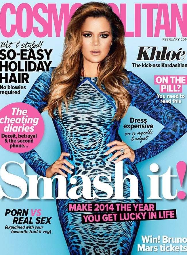 Again ‘Cosmopolitan’ magazine use a circular puff bleeding off the page, the exact same colour to the heading. One thing that these two magazine covers have in common is that the top half of the puff is located above the fold and covering the celebrity arm. I think that by having a puff the same colour as the title of your magazine, it makes it look more professional and look effective as other than the image the magazines heading is usually the first thing people see when they look at a magazine, therefore having a puff the same colour as the heading that will be the next thing the audience will notice. I like the fact that these to puffs are the same colour as the title and a circular shape which is why i will replicate this style into my student magazine or any future work i do which will be relevant for adding in a puff.
Callout
In this magazine ‘Vogue’ uses an interesting callout “think you know Lady Gaga? think again” the use of direct address “you” draws the audience in and engages them into thinking that the magazine is talking to them. This makes the reader more inclined to buy the magazine as they connect to it through this use of direct address. In addition the questioning makes the reader really think about it and answer it in their minds hence why the word “think” is used in callout. The fact that “Lady Gaga” is in a larger capitalized font exaggerates that the magazine features Lady Gaga. This callout is interesting as it grabs the readers attention straight away therefore this could be something i replicate in a similar way when producing my own work
Column Inch 
There are various column inch’s present in ‘Bliss’ magazine cover. This shows that there are lots of articles that the audience can read if they buy the magazine. Putting lots of content in the column inch automatically makes the audience assume there will be lots of content in the magazine and therefore they will be more likely to buy it. In addition to this the column inch gives hints about the content of articles but doesn’t give away the main details so the audience will be eager to find out more.The column inch i particularly like is the text beneath the image in the bottom right side. I think its interesting how ‘Bliss’ has made rectangular shapes the same colour to the heading to make them stand out. The shapes have names of celebrities which will be included in the context of the magazine. It is an interesting and different way of making text stand out which is a unique feature compared to most magazines. Consequently this is a feature which i may replicate in my own work.
