Front cover sketch

front cover sketch

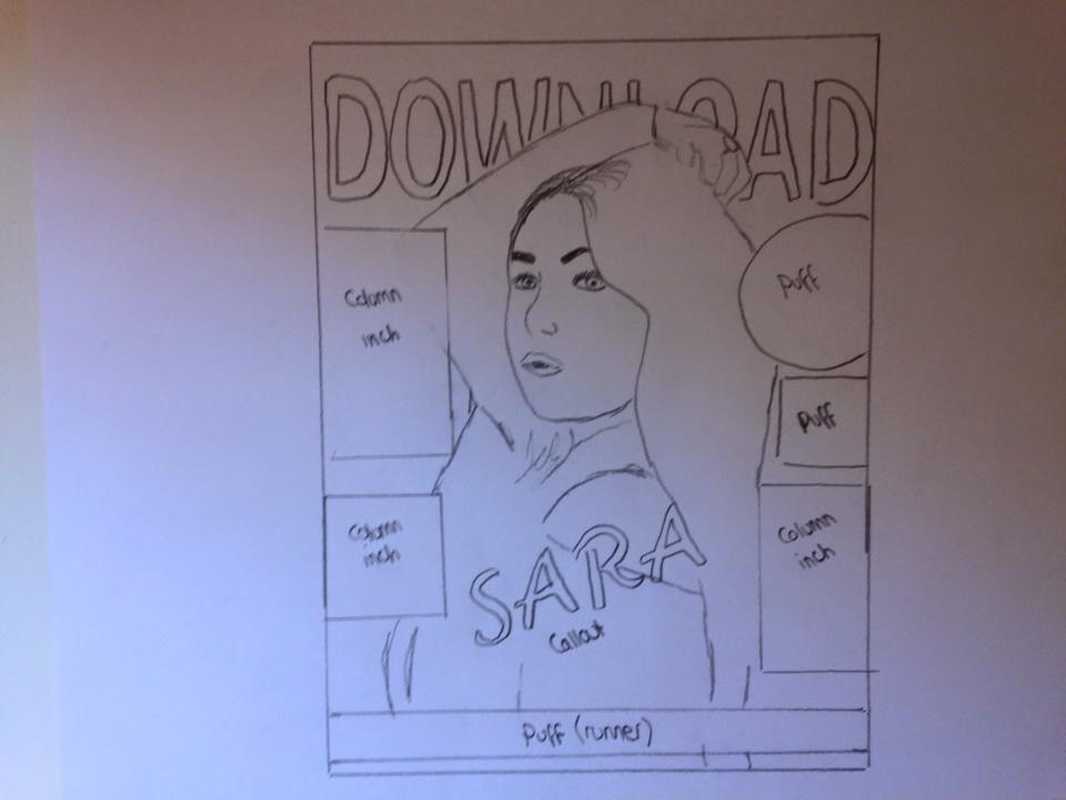
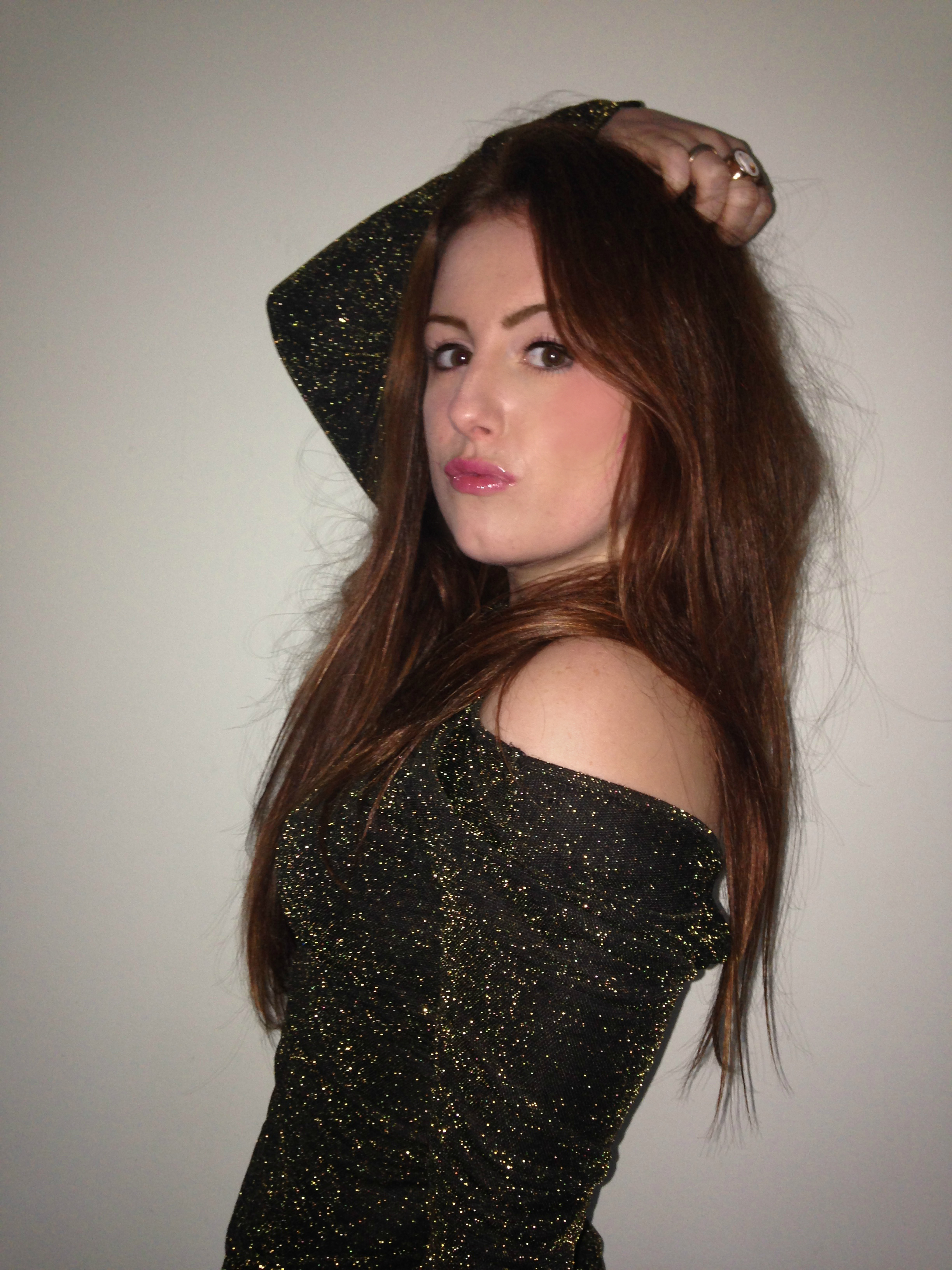
Here is a quick sketch i made of my initial ideas on how i want my front cover to look like. I particularly like the way that Billboard magazine position their title behind the models head and have the last 3 or so letter coloured in. This was a feature i have wanted to replicate from the beginning and is something you will definatley see featured in my cover. Also it looks unique and different which is what i want to go for. I will have the image central with a callout of Sara’s name slightly below the fold as all of my style models have this feature. I will then have column inch’s around the image related to my magazine along with a few puff’s to add detail and colour.

I’ve decided upon an ingenious design element for my title. Turning the D of Unplugged into an actual plug, and positioning it to like its been unplugged from the E… I’m thinking the imagery within the title will help to create a brand for my magazine, an iconic design that readers will relate my magazine with. I may use this design element throughout the magazine somewhat as a logo.

I was debating whether to use a simplistic, black and white colour scheme, or try and work in some colour, but nothing too showy or in your face.  As these are just ideas, I’m not certain on this layout, but I’m pretty sure I would like to include the ripped effect as it helps to break up the cover into an interesting sub-section.

I’m not really decided on much else at this point, I’m starting to think about the sell lines, and I’m considering my photo shoot work and what model to use… Decisions decisions…

Chosen front cover image

IMG_0448 cover

This was my favorite shot from the photoshoot. Therefore this is the image i will be using for my front cover, The lighting, clothing and pose fits perfectly with my chosen genre of magazine.

The other shots were ok however they didn’t fit the style of my music magazines genre as this was a key priority for me. In some of the photos the lighting wasnt very complementary as it produce highlights and shadows in places that didn’t compliment the image. Additionally we changed the clothing several times to make it more appropriate for the R&B/POP representational appearance. But we finally got there in the end and i have a good front cover photo!

I have edited this photo to make it look more professional by removing the red-eye and adding brightness and contrast to boost the colour a little

Selection of images from my photoshoot

This essentially was my first photoshoot, i think it could of gone a bit better as i only ended up with one good photo to use on my cover, however one good photo is all you need! I made sure i found myself a plain white background as this will make it easy to crop the image and to add the text around the image. One thing i found with taking photos is that sometimes the lighting can be absolutely fine, however sometimes in can ruin a photo. Therefore when i undertake another photoshoot for my contents page and double page spread i will consider the lighting more.

This slideshow requires JavaScript.

Photoshot Plan Sketches

photoshoot sketches

Before i begin taking the images for my front cover i planned out my photoshoot by sketching down a few ideas of how i want my model to pose. I looked at several music magazine photoshoots on the internet and some of these poses came up that appeared to work well. Therefore i sketched them down and gave a brief description about each sketch so it gives me a better idea of the poses and clothing for Sara to do and wear.

Photoshoot planning

I have decided to use my friend, Sara to act as my model being a “well known artist” in the UK.

I have decided to do 3 different locations in order to gain a variety of different photos.

LOCATIONS

location one: Plain background

  • As i want my cover to have a plain background i have decided to take photos on a plain background in order to make the image look like a professional front cover. Many magazine front covers have plain backgrounds so this is a basic magazine form and convention.
  • Also this way it wont take any attention away from the main image and it easier to apply text.

location two: a brick wall

  • This location will be effective as it will portray an urban theme that links well in terms of my magazines genre.

COSTUMES

costume one: colourful jacket

  • The bright colours of the jacket will boost colour schemes and make the images not to dull.

costume two: plain white vest top

  • the white top will act as a neutral colour to not only compliment her skin tone but to also draw attention from her hair.

costume three: off the shoulder top

  • I want to thoroughly show the R&B and POP representation of how women are represented in the media. They all seem to have a bit of flesh on show, therefore i want to apply this into my photos in order to get images that show this genre clearly.
  • this will make my model look powerful and strong minded against the media.

MAKE UP/PROPS/

Make up: I don’t want any extreme make up as this wouldn’t work well within the theme of my magazine. In some photos mainly for the cover i want Sara’s makeup to be bold and noticeable, so eyeliner, pink lipstick, and contouring on her cheeks to make her cheek bones more defined and to add a bit of colour to her face. However in other photos i want her makeup to look slightly more natural as this will represent natural beaut as well.

Props: For my contents page i will use a guitar in order to capture and reinforce the music feel to the magazine.