Double page spread – complete

download double page spread finished

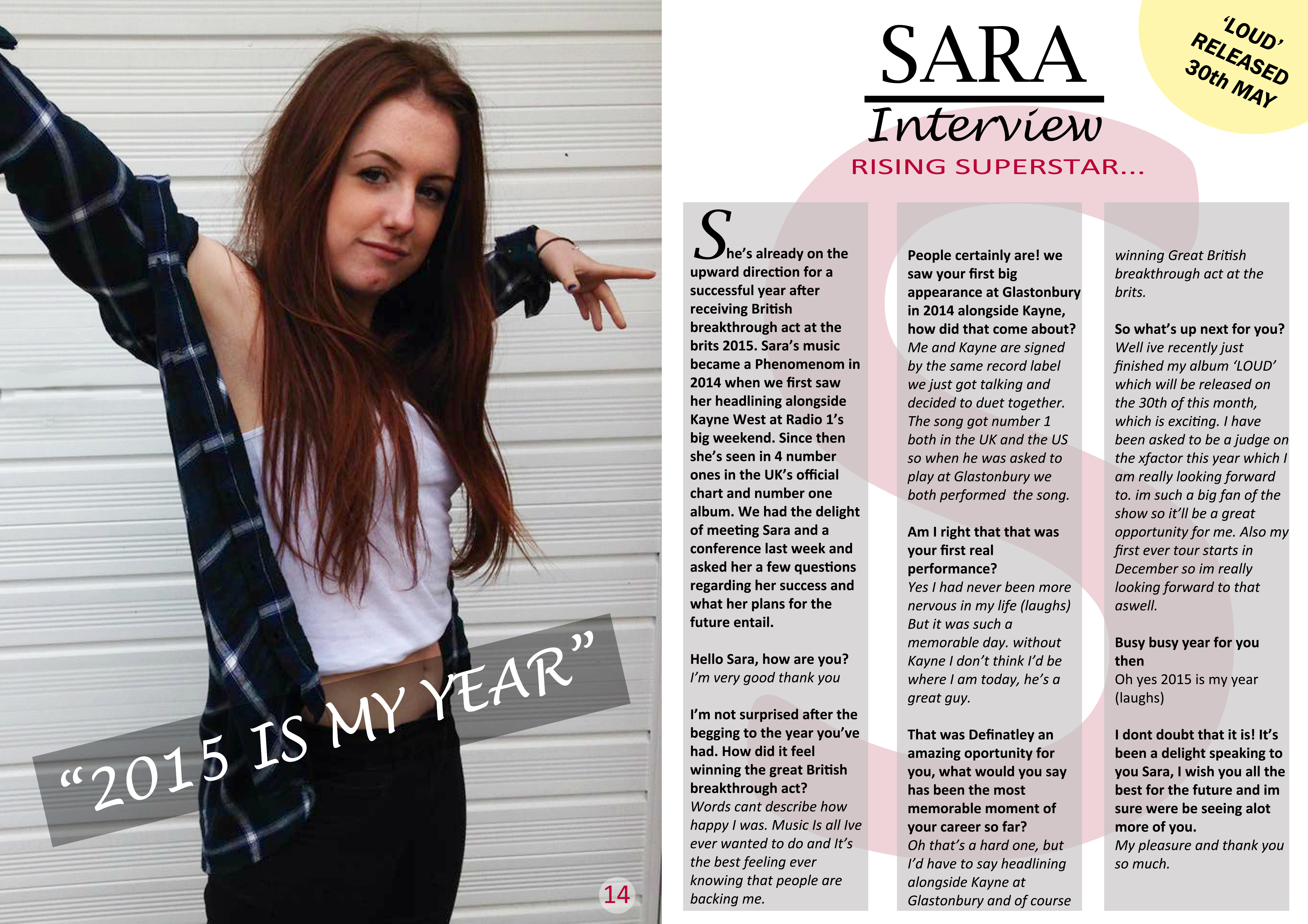
Since my last post, my double page spread has  come together. I have added the text in 3 sections to make it look professional and also added a grey puff behind the text to boost the colour. The next step was that i added a big “s” behind the text as a double page spread that i did an analysis on have this feature and i thought it looked very effective. Additionally i had this feature on my contents page as well so it is effective unique feature that i have maintained throughout my magazine which gives my magazine a unique identity. Also i decided to make the “s” pink as i wanted to keep the same colour scheme throughout my magazine. I then added the text “rising superstar…” in pink font to boost the colour. The last step, was the puff in the top right of the page. I decided to make it yellow because i had a yellow puff on my front cover, again i wanted to keep the same colour scheme.

Overall i am very happy with the outcome of my double page spread. In my opinion I think that I have made it look very professional and unique which is what I was initially aiming for. A big feature of my piece that i particularly like is the pink “s” behind the text, this is effective in terms of my piece being that it is a unique feature. Additionally I have maintained the same theme throughout my contents page and double page spread by including a big letter of the background of my piece. Also i also like was that i made the first letter of my text bigger than the rest. Many double page spread’s do this so it was something i wanted to replicate into my own piece to add profession.

So here we are, this is the end of production regarding my music magazine. Throughout this process I have learnt a huge amount about Photoshop and InDesign, which will serve me well with any future projects. However, I will stop here and save the rest for my evaluation, which will be the last thing I need to publish in order to finish my AS media Blog.

Double page spread – progress 2

progress 2

This is the next step of progress in terms of my double page spread. As you can see i have added the callout “2015 is my year” as this was said by Sara in the interview. I added a black puff behind the text to make it stand out more which i think looks effective. Additionally, i added the tittle of the double page spread “Sara Interview” in a professional font to maintain a realistic double page spread throughout. The reason why i only used Sara’s first name is because when artist such as Rihanna or Beyonce are featured in magazine’s they only use their first name. This connotes that because they are so well known people would only need to say their first name to know who they are talking about. Therefore i used this feature in my double page spread.

Double page spread – progress 1

progress 1

Ok, so this is the first step of my double page spread. As you can see i have resembled the layout of the double page spread’s i did my analysis on. I think that by having one page of a full image and the other side of text makes it look professional and not to overpowering. I decided to place the image on the left hand side of the page as i think it works best. I have also edited the image on Photoshop to make the colours more vibrant and stand out.

Double page spread sketch

double page spread sketch

As i have chosen the image for my double page spread, i have attempted to sketch it in regards of where i want it to be placed on the page. Both the double page spreads that i analysed had the image A4 size on the left side page. I think this worked well and made it look professional, therefore i have decided to use a very similar layout by having my image A4 size on the left page. I will also have a callout near the bottom of the image to add some extra so it wouldn’t just be a page with a photo on. The tittle of my contents Page will be done in a professional looking way by using serif font. I will lay my double page spread text out into three thin columns as i think it looks better than having two larger ones. Lastly i will have a yellow puff in the top right side of the page to again add a little something so it doesn’t look to plain  and basic, additionally by me making it yellow, i am maintaining my colour scheme of black, white, pink and yellow

Chosen double page spread photo

11082968_641585772609031_8485982758_n

I have chosen this image to be in my double page spread as it its quite a ‘swaggy’ picture which connotes power: relevant to the R&B/POP subculture. I particularly like the positioning of Sara as it isn’t just an everyday posy close up shot that is featured in many double page spreads, therefore this is a unique pose. Also i like the clothing that Sara it wearing along with the brightness and contrast levels, therefore not much editing would be needed in this image.

Double page spread photos

Today i took all the necessary photos to create my double spread page.

Like my other photoshoots i positioned my model to pose in an R&B/POP way reinforcing the genre of my music magazine. I think this photoshoot has been my nest so far as all the images are good enough to choose, which means my photo for my double page spread will be exceptionally good and relevant to my chosen genre…

This slideshow requires JavaScript.

Music magazine double page spread text

In preparation for the creation of my double page spread, i have put together and written out an article on the subject of Sara, who is the main feature of my magazine.

I have made my article in an interview format as the responses from my questionnaire stated that most people like to read interviews and reviews, therefore i decided to write and interview. I made my article long enough so create three thin columns as i think this layout looks best and more professional.

She’s already on the upward direction for a successful year after receiving British breakthrough act at the Brits 2015. Sara’s music became a Phenomenon in 2014 when we first saw her headlining alongside Kayne West at Radio 1’s big weekend. Since then she’s seen in 4 number ones in the UK’s official chart and number one album. We had the delight of meeting Sara and a conference last week and asked her a few questions regarding her success and what her plans for the future entail.

Hello Sara, how are you?
I’m very good thank you

I’m not surprised after the begging to the year you’ve had. How did it feel winning the great British breakthrough act?
Words cant describe how happy i was. Music Is all I’ve ever wanted to do and Its the best felling ever knowing that people are backing me.

People certainly are! we saw your first big appearance at Glastonbury in 2014 alongside Kayne, how did that come about?
Me and Kayne are signed by the same record label. We just got talking and decided to duet together. The song got both number 1 in the UK and the US so when he was asked to play at Glastonbury we both performed the song. 

Am I right that that was your first real performance?
Yes I had never been more nervous in my life (laughs) But it was such a memorable day. Without Kayne I don’t think I’d be where I am today, he’s a great guy.

That was definatley  an amazing opportunity for you, what would you say has been the most memorable moment in your career so far? 
Oh that’s a hard one, but I’d have to say headlining alongside Kayne West at Glastonbury and of course winning great British breakthrough act at the Brits.

So whats up next for you?
Well ive recently just finished my album ‘LOUD’ which will be released on the 30th of this month, which is exciting. I have also been asked to be a judge on X Factor this year which I am really looking forward to, I’m such a big fan of the show so it’ll be a great opportunity for me. Also my first ever tour starts in December so I’m really looking forward to that as well. 

Busy busy year for you then
Oh yes 2015 is my year (laughs)

I don’t doubt that it is! I’ts been a delight speaking to you Sara, I wish you all the best for the future and i’m sure were be seeing alot more of you.
My pleasure and thank you so much. 

Music magazine contents page – completed

download contents page finished

My contents page is now complete!

I am pleased with this pages as i feel i have followed professional magazines conventions and have applied them in my own, for instance Vibe’s contents page. I have maintained “downloads” identity with using the same colour scheme minus the yellow as it didn’t compliment the other colours in this case so i decided not to apply yellow here, however i will in my double page spread to ensure i am keeping the same colour schemes throughout my music magazine, I also like the composition and layout of this piece as i feel it is much more professional looking at the text is all together on one side of the page which follows magazines basic conventions, along with a large image towards the middle of the magazine. In terms of things i could do to improve it i personally don’t think i could improve it although every one has their own opinions. I have worked really hard on my contents page reorganizing the whole layout, therefore in my eyes i have already improved on it in order to present this as my complete contents page.

Music magazine contents page – progression 3

CONTENTS PRGORESSION 5

This is the last step regarding the process of my contents page. I have positioned the magazines content text down the left side of the page with the image of my CD cover i made placed at the bottom of the page. Personally the layout of this contents page looks reletivley more professional than my previous one, therefore im am happy with the final outcome. The extra work has payed off…

Now onto my double page spread