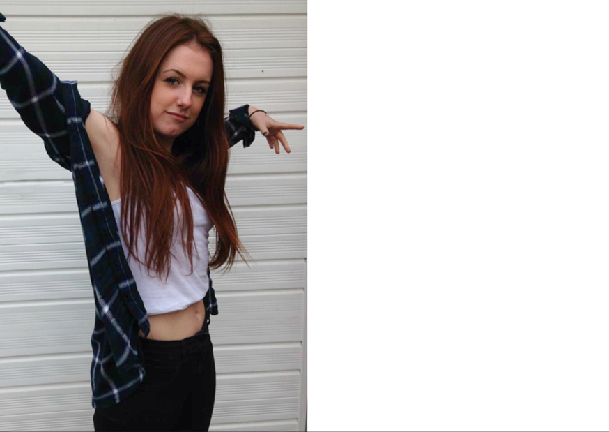
Ok, so this is the first step of my double page spread. As you can see i have resembled the layout of the double page spread’s i did my analysis on. I think that by having one page of a full image and the other side of text makes it look professional and not to overpowering. I decided to place the image on the left hand side of the page as i think it works best. I have also edited the image on Photoshop to make the colours more vibrant and stand out.
